Thursday, December 18, 2008

pirates of the copyright


http://www.mwctoys.com/REVIEW_010408a.htm
http://www.coloring-book.info/coloring/coloring_page.php?id=113
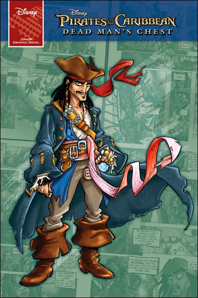
when i was in disney i saw these cartoon versions of the pirates of the Caribbean characters but i cant find a name or specific keyword for that style/series. if you google pirates of the Caribbean and comic/cartoon/coloring pages/animated/ you can find a few images. there are action figures etc. but there is no credit given to a designer like there is for lilo and stitch as that style is attributed to chris sanders.

however in goto's class i did discover a european comic called belladone, which looks strikingly similar. disney may have been basing the style on the artist as they planned to do with Atlantis and mike mignola (hellboy) before they just called him up and hired him.
http://www.stuartngbooks.com/preview_belladone_t1.html
http://www.stuartngbooks.com/preview_belladone_t2.html
http://www.stuartngbooks.com/preview_belladone_t3.html

Friday, December 12, 2008

Transplant - to make a short story long

Transplant is posted at webcomicsnation so go read it here.

This page was meant to be the page before my story, in Amanda's proposed but never published Apologue book, you can find more links to her art, thoughts on the book and ways to contact her at her deviant art page here. About a year ago, aaprox. sept. 2007, She held a fan art competition I asked if i could do a fan comic, came up with this and then she asked me to make this page to explain it, just read it. Below is a paper I wrote for Bob's class explaining some of my thoughts further, but with the prospect of its publication looking gloomier every month I have decided to publish what I had previously and curiously kept under wraps.


Fan Comics: creating comics inspired by other comics.
By Zach Bassett
Knowing that my story would encompass multiple locations meant that I would need to detail backgrounds and base my story in a more solid reality and physical world that Mythchan’s surrealistic watercolor dreamscape. However I also knew I was going to need to fit seven to ten panels to a page in order to tell my story, in the five page limit set by the competition. Though I did change my style a bit to fit with that of her manga inspired characters, I had to follow, be inspired by and essentially transplant Sleepsong in tone, subject matter, and theme more than I would be able to visually.

At the time I was approached about the fan art contest I was reading A Foregone Tomorrow and The Counterfifth Detective from Virtigo’s 100 Bullets series, featuring art by Eduardo Risso. As I skimmed through it visually, I noticed the amazing number of panels he was fitting on the page and knew he would be a perfect artist to look at for my own similarly panel heavy story.

A few days earlier a friend had seen my pencils for Transplant and told me it reminded him of an artist named Stuart Immonen. So I went to his website and found one of his blogs particularly pertinent. After briefly discussing how comics rely on deadline he hit went to the figures, saying that the average comic page has anywhere from four to seven panels, and the average superhero comic book has something like 90 different drawings in a 22 page story. In 100 bullets there was an average of nine panels per page, and you wouldn’t even need all your fingers to count the number of pages containing six panels or less. Needless to say Risso did quit a bit more than 90 panels a book. Risso’s style is not necessarily simplified per say, but does rely heavily on lighting to and separate foreground and background.

I probably should have taken note of his figure shading though, I left my characters shadowless in almost every panel and relied more on line weight to separate them from their backgrounds. Speaking of backgrounds, the stylized noir-like backgrounds and lighting of Risso’s 100 bullets and Tim Sale’s Batman: The Long Halloween gave me great ideas for simplified environments.

All in all, Transplant, while heavily influenced by Mythchan’s Sleepsong, Transplant turned out to be quite a different animal than I thought it would be. But thanks to some inspiration from Tim Sale and Eisner Award winning artist Eduardo Risso I was able to make Transplant into an easily readable story, despite it’s dense number of panels. For a more intricate look into the inspiration for Transplant as well as Mythchan’s original story, Sleepsong, checkout her self published Applogue.


I did the story, pencils and inks over a weekend on top of other homework, these were my thumbnails, pencils, inks and rough dialog, i scanned them before trashing them.


inks


Friday, December 5, 2008

final capricious alchemy logo


here's the final logos in black and white versions, i went to the extra trouble to rasterize them for illustrator (meaning they are now mathematical equations that may be sized up or down as much as you want and they will still have a sharp edge. i can add the text to the cd cover as soon as i receive payment.

Wednesday, December 3, 2008

Qutluch assassin

i did the inks on the plane back from tx, here's a couple different versions i was messing w/. i dont know why i like lens flair i know its cheesy, anyway w/ my girl friend's help i came about the final version which you can view on my deviantart page here
i put a glow around the top side of the knife which was inspired by this poster i have in my room and i love how it was colored.


while i was in tx, i stumbled on a david mack gallery that was awesome and the best comic shop and biggest ive ever been in. they had an entire wall of discount graphic nocels all for like 1-8 bucks. that was awesome.

Thursday, November 20, 2008

winter break 08

*warning this link and paper contain what could be considered mature content*

this is a paper my friend, james whynot wrote on one of my pieces. if you'd like to see his artwork you can view it here
or the piece to which he is referring here.
other than that, its break. odd term though because i have to do 5 pages for phils comic book, pencil, ink and letter. write issue 3 of maelstom with james, ink my pages from issue 2 and pencil my pages from issue 1. write a script for superhero class next quarter, do my star trek covers as well as finish redesigning the logo for capricious alchemy. guess how many of those jobs pay... 1. however its all work, hopefully portfolio work. and i know im going to kick ass at editors day this year so here's to that.
i also intend to post on the da forums for commissions, hopefully that will up my viewers and income, not to mention artwork output. wahoo, break - my ass, this will be catching up on everything i put off time.

Tuesday, November 18, 2008

progress - almost done


these are my in progress inks for my 4 pgs, all brushpen so far. it gets sort of confusing in the jacket on the last page so i will fix it.
here's links 6-7, 8-9 to the finals.

this is a printout of my tight roughs that i tightened and mixed with the hand from teh skecth below it, the earlier can be found on my earlier post.

these are some sketches i did to help with the hand on teh covers i did on my deviantart page for maelstrom.


some awesome phantom pages i colored from nick derington on splashpageart.com.

heres a color of an awesome bryan hitch dps.

Tuesday, November 11, 2008

tight roughs last pages issue 2


these are all free fonts that ill probably draw from and mix, see if any fonts/letter designs stand out to you. ill also incorporate the candle motif into them as well.


these are some roughs for teh logo redesign for capricious alchemy. they are dreadfully similar but its a start, i will try and do more soon.


influenced alot by pages ive been looking on splashpage art.com from nick derington
i LOVE his work, inking, style, sorytelling.

Monday, November 3, 2008

everybody started somewhere


heres my ideas and tight roughs for covers for the comic ive been working on.

this is a pic i quickly colored for class.

yes i did tighten up pg one before i inked it. my final pages can be found in my deviantart gallery.

this was a cheesy comic i found laying around in noris and then i realized the artist on the cover was one of my (now) idols, mike deodato jr. who has recently worked on tigra, thunderbolts, hulk, spiderman, moonknight. he has come a long way since this piece in 1996, but it just took this piece to make me see him as a person, lower him off his god like pedistol and say if he can change that much and be where he is now, who says i cant. i later put the text on it and hing this up in my room as inspiration.

and last this is my inks for the new startrek cover, the colored version of which can be found on pendant audio's website or my deviant page. i was actually quite pleased with it despite inking it right after i woke up and the size only being 7x6" max. i added the hatching and feathering as lightly a i could at the last minute and really loved how it came out, i had been looking at a lot of bryan hytch lately, though it doesn't show too much.
alternately ive been trying to research a japanese artist named leiji matsumoto whos been doing and manga since the 70's such as gun frontier, galaxy express 999, and captain harlock. but i can barley find anything on him let alone images of his work for some reason. i also got robin hooked on x-men by reading chris bachello and humburto ramos' "supernovas" graphic.

Thursday, October 30, 2008

interviews and anthology

well i got interviewed over the internet, im boring but - hey its my 1st interview,
if you want to listen go to
http://pendantaudio.com/twipeps/TWIP99web.mp3

got my anthology submission submitted, lol, i was there from 8am-1030pm today working on that and about 3 other things. you can see it at my deviant page.

jorge zaffino became and has slowly been becoming my favourite artist, he inks himself but is amazing. he's definatley not one of those artists who's work is transparent to the story - you are able to see the process but the finished product is an amazing piece of art and combination of countless techniques and materials. i was truley inspired by him and have looked back at idw's "seven blocks" more and more since i got it a few months back. he died in 2002, before i even knew about him. his style is so loose and textural but so perfect that you know what is going on and it becomes so realistic.
http://www.jorgezaffino.com/index.html

Tuesday, October 28, 2008

Anthology pencils


a quick color of a night crawler drawing by the great lp, for julie's class.

here's my pencils for my anthology that i need to ink and letter by friday.

Saturday, October 18, 2008

24hr comic competition - Flop

So it didn't work out. I wrote a great story, thumbnailled, character designed etc all there and it took a few hours, then i started working. the white sharpie didn't do squat, my soup i had warmed up for myself was cold. the people in the room were lame, i was working way too big. there were a million reasons that it was better to just come home but in hopes of helping someone out for next year i thought i might pass along a few tips.
Don't work bigger than 9x12 - you wont have time to fill in blacks or put in details that would require bigger paper - so why do it.

check your supplies - make sure white out, erasers, pencil sharpeners, paper

cover yourself health wise - bring a jacket/change of clothes, something warm, something cold, something to drink, something sweet, something wholesome. don't drink too much sugar or caffeine - you will crash. get comfortable, and bring music.

think of your story before you get there. you have 24 hrs to do 24 pages, that'a an hour per page. if you have to do all the research and everything there like i did you will never finish. while it is technically supposed to all happen there, at least do character/environment designs before hand if not thumbnails or a script.

bring a bike - if you have to get anything - food, supplies etc. at least have an option for doing it quickly.

im still doing my story but it will be a while. but all the major stuff is out of the way, maybe ill save it for next year, summer or break.

Thursday, October 16, 2008

Computer coloring


a sketch i used to digitally ink the guy in teh front

this was the origional inks traditionally, i started on pencils and was so excited i went to inks but they turned out bad.

here's the final version of inks, much improved redrew the hero character and added a lot of texture and shadows. all the corrections are digital. you can view my final colors on my deviantart page.

here's a sketch for the surrealism piece i did for art history.

and here is the final with the color sucked out of the skin, it turned out being eerier with it normal but anyway here it is to see. you can see my final on my deviantart. its my 1t computer painting, and after this class we will be learning painter so it will probably become quickly obsolete.


these are my colors or travis charest's "space girl" web comic which is awesome.

and this was my inclass midterm for computer coloring. 2 hours exactly. jr senior for the art - duh!