Tuesday, June 23, 2009

Work - Yay!


here's the inks for the piece on the previous post.

So after a few days of looking around and sending out about 25-30 emails, I've found a few freelance gigs.
I'll be doing a set of 50 8x10 quick paintings for a local band called the AQUAJONES, for their promotional packets.

I'll also be working on a secret project - all I can mention is what was mentioned on their post on Digital Webbing since I have to sign a non-disclosure agreement:
Artist Needed For Super Hero-Related Marketing Project
First off, this is a "purely for exposure" kind of gig.

I'm heading up part of a team developing a promotional campaign for an upcoming web series. As part of our efforts we're developing at least one mini-comic.
We'd need either one artist or a small team to help produce around eight pages of sequential art--pencils, inking, coloring and lettering.
This could be a fun project for the right person/team. You'd get full credit and your work would be part of a project with potentially high visibility.

I'll be scanning my skateboard designs and getting in touch with them this next week - should go well.
I got a lot of nods from people on Digital Webbing but was ultimately passed over, not bad for getting my foot in the door. Hopefully I will be able to post some work soon, as the Aquajones need the first 10 by the end of the week. I am still w/o a scanner but it is the first place any money from these projects will go. I also put up a piece I did a while back for Dave on DA.

Wonderboy: Hero Initiative by ~xaqBazit on deviantART
I also just acquired the "best selling graphic novel of all time" - The Death of superman and was disappointed that Jurgens/Breeding only did 2 issues, but I should have known since the GN is compiled from all the differnet issues from different superman series that the Doomsday event crossed over into, so the regular artists form each got to do an issue too. Jurgens/Breeding's style for the actual issue, (Superman 75) is rather strange.

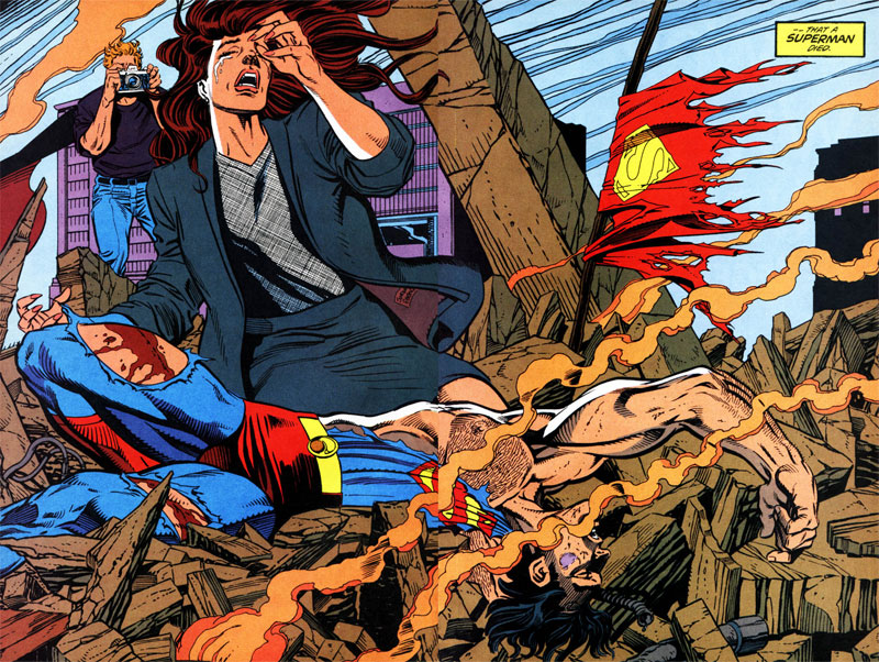
It's all full page spreads, some of which are majorly wonkey, others are great, all are iconic, but its almost as if they worked on them smaller and blew them up. The feathering and line weight are way larger than you would ever get with panel-to-panel pages. Idk, just an observation. Also noticed that this image by Bruce Timm is based of one of the small panels that Jurgens/Breeding did in Superman #74.

I'm also trying out for a new Metal-core band tonight called Next of Sin. Well see how it goes.

Monday, June 22, 2009

Forbidden Fruit


Temptation: Triplett by ~xaqBazit on deviantART
This was just a fun piece to keep me drawing, it was an idea I've had for some time and never got to do. I (unfortunately) don't have a scanner so I had to use my camera but it was done using Tech Pens on a scrap of Illustration board, with some white out over top. I couldn't decide on colours so I went with all three. I went much the same route and format as I did on the skateboard designs I've done recently as far as composition and inspiration. I was very inspired by the art and working method of a particular deviant THEIRISON As well as LIDETO
It would make a good wallpaper, very pop art, no?

Thursday, June 18, 2009

Update


this is an old coloring piece I did for julie's class. I've been applying for the whole spectrum of comic's positions.
Hey all, i haven't posted as often as usual recently. Ive been out of school and saving up for a scanner. Been working on various side projects like:
Maelstrom with james,
Phil's prequel comic book to his student film\
possibly penciling a comic james wrote and him inking it. But were working the script over first.
I designed a tattoo for my brother and have been taking it pretty easy since I just moved out of georgia this last weekend. Other projects I'd like to work on include:
a 9-11 firefighter story I wanted to do for 24hr comic day,
Vicky's Unnaturals,
my 6-issue Subhumans super-hero book
a special project I want to take some time writing called "the Samaritan."
i hope to work on these self published books as a way to keep working and creating a fresh portfolio and send new pages out every couple of months.
Ive also completed over 15 skateboard tight roughs that me and James will be sending to a connection of his for approval by the skate team before we finish out a select few. I'm excited and am researching comic companies in my new home to see if i can go visit and make some connections.
We've also been keeping a pretty intense conversation going on at Tom's blog about the industry in general along with some more specific points.
I'd also like to start opening commissions over DA, as I have been seeing a lot of poor or decent artists making hundreds at it, with little to no effort. Tattoo designs, portraits, pinups anyone?
Ill also be checking back every few days on digital webbing's wanted pages.

Wednesday, June 3, 2009

Definat 35


Defiant 35 was probably my least favourite cover I've done for pendant. But this time everything, including the script was better. I was even thinking of giving up doing covers from them because I just wasn't inspired anymore. It's hard to make Star Trek exciting and not make it look like a bunch of stuck up sci-fi geeks standing around in spandex, they don't have the muscles to make them look cool like super heroes so they just look like regular people in extra ordinary outfits. This last episode had the crew disguised as the Breen, which despite having a helmet directly swiped from Boush from Star Wars is pretty damn cool. I was looking at this book of fleer star wars trading cards I had lost as a kid and recently was given as a gift - anyway its got lots of pieces by lots of famous artists I now know, but didn't at the time and this one particularly caught my eye. I quickly saw it was Mignolla and was just blown away at how powerful his stuff always is despite being simple and he uses so many techniques that are his trademark.

Anyway, So I scanned it and swiped the colors and was really hooked on the yellows I think I was channeling Dune or something, but eventually I just wasn't sold on the whole "yellow snow"-thing, call me weird, or just a boy. So i eventually but a blue layer over the top and set the layer to hue. I had tried messing with the colors and adding more blue and sucking out the red to make it feel colder but it still didn't sell the idea of "cold" like blues and purples.


Another fun thing was that I knew I would need texture for the snow but it would also need to be coloured white so instead of drawing it out and then having to color the snow white in photoshop I just drew some scratchy textural things seperate in black, inverted them in photoshop and added them as a layer above the line art after i set the layer type to cut out all the black - the same process I used for the Kryton logo and any white on black text I do in comics. So anyway, it worked, it was fun, and it looks frign' sweet.

I did fight with the size of the Defiant cover, as I usually do. With the text on top (unlike comic books) and the title centered at the bottom) and the whole cover being closer to magazine format than comic book, by the time you get done you really are working with a safe area that is more of a horizontal rectangle than a verticle one, so i swiped and clone tooled my way out of it but as always it catches me off guard as I am used to working in comic book format. The composition was inspired by a splash page Tim Sale did of Batman in a riot outfit, in The Long Halloween.

Star Trek: Defiant, Ep. 36 by ~xaqBazit on deviantART

Monday, June 1, 2009

Simpsons and Constantine

These were done as part of my "Character design and storyboarding" class, over a year ago, and animated last semester in "Adv. survey of computer art apps"
Its the first few minutes of episode 10, season 1: Homer's night out.
A bunch happens in a short amount of time, you can watch mine here

and watch the real one here.
The Simpsons 110 Homer's Night Out
I didn't see the episode recently until after I was done storybording it but they are rather similar.
also i thought I'd post a few pages we did of Hellblazer we colored and lettered. The font didn't come through for the lettering unfortunately but I guess you can see the balloon placement if nothing else.


also here are a few clips and trailers for a student film called "the winter of 1914" that i did the storyboards for. I'm trying to get a copy of it so I can sync the audio to the storyboards like I did for the simpsons but contact with the director and even the editor (who posted the videos" has been difficult and sparse.


i also was a production assistant (PA) back between highschool and college on a movie called "the Sensei." Which is making it's rounds at film festivals now.


and oh yeah! i started a blog for my Radio Drama and the first episode came out about a few weeks ago. You can learn more and listen to the first episode, here.