The band I did these for (Aquajones) were nice enough to let me show them to you all. You can hear their music and see alternate scans of a few of these images on their myspace page here.
Aquajones by ~xaqBazit on deviantART (Below) i was trying to figure out what or who aquajones could be and I thought of Scuba Steve from Big Daddy. (Above) Again playing with "AquaJones" this time making him look more like an action figure. (Above)i was going for a Betty Page kind of look but the way her eyes and her mouth came out reminded me of the Max Fleischer Lois Lane.
(Unrelated) Juts thought I'd post this. It was my first envolvement (professionally) as I had done theater posters as early as grades school (Willy Wonka) and High School (the Importance of Being Ernest). But this was for an actual theater company for which I also designed the logo (lower left) Fire House Theater company in Colorado. Both of which were colored by a professional friend, Danielle, through which I learned a lot about the process. But I did the inks and drew the image. I drew the tree the bee's and the ground all separate so we could place them to fit and I think it worked wonderfully. Here's a close up on the logo I designed for them some 5/6 years ago, and again it's colored by Danielle.
Here's my new cover for Pendant Audio's ongoing fan radiodrama. The drawing was hard actually, I've fallen kind of out of it but am working on getting back on top with a few other projects because I've been so busy, and it looks like I'll be moving yet again here in a few months. The inking was okay, using brushpens and tech pens again, and I got some cool fx by setting two similar photo textural layers (of the sunset through a dirty windshield) to "multiply" (grayscale) and the other to "color burn" overtop and under my line art. The streaks gave it a cool brushed painterly look at certain spots but overall the photo gave it an awesome color palette. The stars were the same texture page I made for the last cover but overlapped and used bigger to look like stars instead of snow. You can listen to this and other episode at pendant audio's website.
Star Trek: Defiant, Ep. 37 by ~xaqBazit on deviantART I've also been doing some promo-pack covers for a local band called Aquajones. 10 down 40 to go. And I might be doing t-shirt designs with a Denver based clothing company DVLP soon. No word yet on the skatboard designs, poo.
So after a few days of looking around and sending out about 25-30 emails, I've found a few freelance gigs. I'll be doing a set of 50 8x10 quick paintings for a local band called the AQUAJONES, for their promotional packets.
I'll also be working on a secret project - all I can mention is what was mentioned on their post on Digital Webbing since I have to sign a non-disclosure agreement: Artist Needed For Super Hero-Related Marketing Project First off, this is a "purely for exposure" kind of gig.
I'm heading up part of a team developing a promotional campaign for an upcoming web series. As part of our efforts we're developing at least one mini-comic. We'd need either one artist or a small team to help produce around eight pages of sequential art--pencils, inking, coloring and lettering. This could be a fun project for the right person/team. You'd get full credit and your work would be part of a project with potentially high visibility. I'll be scanning my skateboard designs and getting in touch with them this next week - should go well. I got a lot of nods from people on Digital Webbing but was ultimately passed over, not bad for getting my foot in the door. Hopefully I will be able to post some work soon, as the Aquajones need the first 10 by the end of the week. I am still w/o a scanner but it is the first place any money from these projects will go. I also put up a piece I did a while back for Dave on DA.
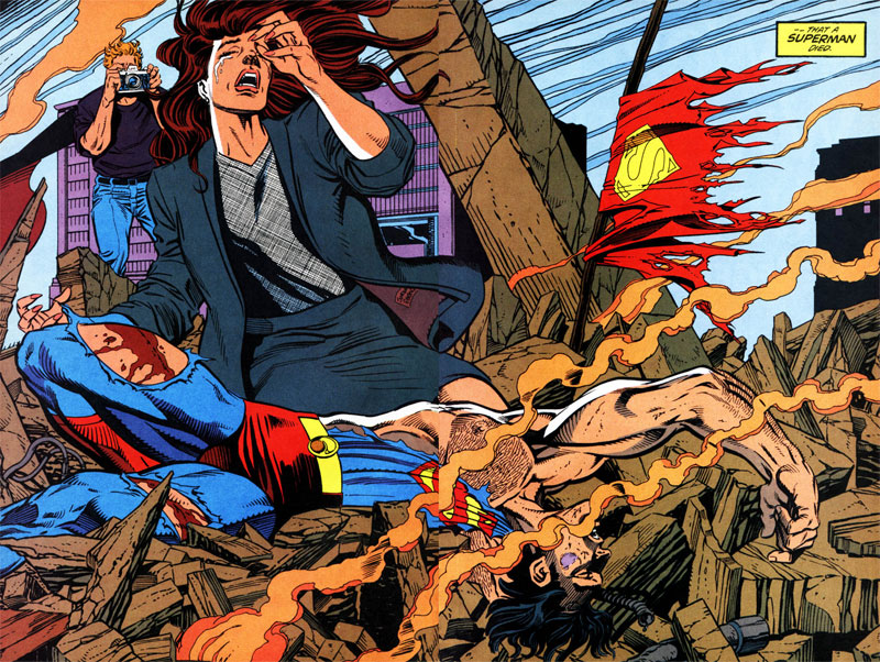
Wonderboy: Hero Initiative by ~xaqBazit on deviantART I also just acquired the "best selling graphic novel of all time" - The Death of superman and was disappointed that Jurgens/Breeding only did 2 issues, but I should have known since the GN is compiled from all the differnet issues from different superman series that the Doomsday event crossed over into, so the regular artists form each got to do an issue too. Jurgens/Breeding's style for the actual issue, (Superman 75) is rather strange. It's all full page spreads, some of which are majorly wonkey, others are great, all are iconic, but its almost as if they worked on them smaller and blew them up. The feathering and line weight are way larger than you would ever get with panel-to-panel pages. Idk, just an observation. Also noticed that this image by Bruce Timm is based of one of the small panels that Jurgens/Breeding did in Superman #74. I'm also trying out for a new Metal-core band tonight called Next of Sin. Well see how it goes.