Wednesday, September 9, 2009

The final cover/frontier


got to do a comission for my friend's girl friend. Charcoal, 18x24.


here's the original inks, used some quill, some tech pens and sharpie.

here's the inks with some textures from a few posts ago, and some more blacks digitally filled in (sorry still has the glow form the coloring layer on the candles.)

here's an alternate colored version, i wasn't satisfied with it (the real one) the night of but woke up the next morning and gave it another look and saw it was fine. it will be my final cover for pendant audio as i move on to even more ever more time consuming projects.
below is the final version.

Star Trek: Defiant, Ep. 39 by ~xaqBazit on deviantART
just finished my last page for the 8 pg pencil/ink project i found through digital webbing, some of my best work yet. cant say much till it gets published but i learned a lot doing them.
also just finished my cover for what the flux comics, still needs colors but it rocks already.

Tuesday, September 1, 2009

mini-mega-con

Got back from my first comic-con last week and took my portfolio around to show. went to see some of my favourite artists and came out getting to know some new ones.
People I knew going in:
Dick Giordano - was very hard of hearing but also one of the nicest guys in the business. He liked my work and said it was hard to break in, and pointed out the gun in the second to last panel of pg. 2 in my Hickok stork and said "that's not a gun, that's a lolly pop" him and his wife were selling art and he has just taken an assistant.
Chuck Dixon, Darwyn Cooke, Tony Bedard, and Jimmy Palmiotti were all nice and did a panel on writing "tough guys." Which was good and different than you might think these guys would think about their characters. That night I got to hang out with most all of them including Alvin Lee at the hotel bar and talk about all sorts of stuff.
Never found Tim Townsend - but he's cool too and it would have been great to see some of his stuff up close.
Jimmy Cheung - said he didn't really look at portfolio's and was working on a commission all day long that was amazing. I talked to him about his style as I loved it and thought it was a great mix of manga and american styles, he commented and continued to work diligently. He was nice, but said it took him a long time to do his pages and that he thought he was slow.

People I didn't:
Pat Broderick - a very nice artists who's worked for marvel in the 90's doing spider-man and Doom 2099, he now is a teacher at the International Institute of art and design. He mentioned having a foot in every door, as he moved to doing storyboards when comics started to take their flop in the mid/late 90's. Thought I might do well doing a few war story samples to mix reference with my action/storytelling.
Morry Hollowell - colorist for the Oldman Logan and much of Steve Mcniven's stuff. talked about his process and his relationship with mcniven through the years as he wrapped up the final book for the Old man Logan series.
Drew Geraci - who has inked who has inked over mcniven and had some pages by Rags Morales I really wanted, was cool. He thought my inking was slop and compared to his it was. he showed me how well he could ink a circle w/o a template and fake straight lines, said it was all practice and you could tell he had.
Casey Jones - worked on spider-man and various x-character books had a lot of good feedback. Recomended a few books that helped him understand hands, as i mentioned i needed help simplifying them. He draws panels seperate then shrinks/blows them up to fit the page. He flips and worked on the back like Clement demoed at scad a few years ago and uses sketchup to comp the tech in, then inks everything together to make it all work as one. I had a page from a writer with over 9 panels and it was hard to read, he said "it might be their fault to give you this many but its still your job to make it work, and your fault if it doesen't." he talked about anatormy being a composition of softly curning lines intersecting, but where they intersect makes all the difference, and spoke about the rhythm of those lines with one another. he drew great simple hands. He was big on leaving space above the character's heads to fit dialog and that the panel size should match the action and said i had a lot of wasted space in my new pages, though they were spaced that way (not above the character's heads) for where i intended the dialog. Him and Synott probably looked at my work and gave me feedback individually for probably a good 20-30 mins each.
Alex Saviuk - has drawn for the daily spiderman comic for the newspaper for a while now with joe sinott. Some times one inks the other pencils, vice versa or both. A friend of mine made the mistake of calling him "oldschool" which he didn't like, but he knew his stuff and used tracing paper i brought to show me how he would have done things differently. Like lyle, he liked my pieces but said the bodies weren't working as a whole. And one of the best pieces of advice he gave was to start your portfolio with your tightest work, I started mine with my newest stuff, though not as tight, he explained why and it made since. He also talked about how to make hands/bodies more feminine (much of what lyle told me too) and little things you can do to sell the likeness of an object to the viewer. he mentioned a few books and was very nice. Seeing his art at (that is still done 2 fold bigger than it would be printed in comics, and even bigger than that if printed in a newspaper) made me want to work that size.
Mike Perkins - pencils and inks himself, using some reference but pencils very loosely before just laying figuring it out in ink, though you'd never know. He is awesome with a brush and said he usually takes 2 weeks to pencil and 3 to ink a book but is on a schedule where he can do that.
Sergio cariello - like, Mike, Sergio inks himself and used to teach at the Kubert school, his work in some cases is very reminiscent of joe's work. But he was probably the most inspirational, and both him and Perkins talked about inking the pages together so they have a since of unity and finishing the whole book in stages of completion so you don't completely finish 15 pages and have stick figures on the last 7-9.
Everyone (who worked there) talked about working at crossgen, most of them had, and said it was great. studio setup everyone saw each others work and it drove them to do better, they got health insurance and between all the guys had a massive reference library.
I also got to see some of Linel yu's rough pages on 8 1/2x11 that his rep was showing Billy Tan.
On my end:
I got lots of good feedback and met editors from several small companies who all gave me nods on my work and I even ended up doing a small amount of inking over one of the artists there which lead to a job. So I will be starting with What the Flux comics when I get back into town.
Met a new friend named Larry who's art can be found on his blog, he's working on a book for top shelf.

Tuesday, August 18, 2009

The Osprey


above are the inks w/o leveling them in photoshop, I used the brush they included and the tech pens that are in the pack.

Commission: The Osprey by ~xaqBazit on deviantART

I had to create a sequence using my own character, letter it myself and ink and color it - using only the tools in the pack that it will be sold with. Here is the colored version.

Suffice it to say I was less than thrilled about coloring it but I still had fun with it, despite being able to blend a convincing flesh tone. And below a picture of how and where it appears in the booklet in the "Complete Comics Illustration Kit" from Faber Castell.

Here's a link to my turnarounds and maquette I did for him semesters earlier. I kind of stole Rorschach's face from Watchmen as I had just watched the Motion Comic the week before, Did I mention I had to do this in a week on top of my schoolwork? And then I had to throw in the "stunner glasses" for my bro - they made it into the final clip in the book. This was my first official paid comics page too, so I was delighted to do it regardless.

Thursday, August 13, 2009

Deadclaw


Deadclaw: Commission, Inks by ~xaqBazit on deviantART

Deadclaw: Commission, color by ~xaqBazit on deviantART
Really worked on my inking here, and worked big, which I do better with. I've done some other brush stuff for DVLP clothing that will be in their fall '10 line. Very proud, thought I'd use it to try and get some work. Also just finished my 1st 3 pgs of the secret project in my first full day of work. Need to do 3 more tomorrow and 2 on Saturday to hit my deadline before I head back to my job.

Tuesday, August 11, 2009

Sunday, August 9, 2009

Giant Art Review

So recently I’ve been getting a lot of graphic novels through Swaptree.com, and or Half Priced books, here in Austin and even the local library. I thought I might share some thoughts on what I’d found.

Captain America: the new deal - Cassaday defines his post Planetary style, and develops an entire way for Captain America to move. Much like what has become customary for other marvel characters such as Spider-man or DC’s Batman. I noticed him moving very symmetrically, which was cool, and all the art is very iconic and has been since it came out a while ago.

Also, picking up where Cassaday left off another modern artists I like, Simone Bianchi, took over Astonishing X-men and I was able to pick up the first couple issues. Its an interesting transition because both use some inkwash and are fairly realistic, but as I’ve mentioned before (and I think it worked with Whedon writing it and having a background in TV and film) he used almost exclusively full-tier panels and gave a film-like experience. Bianchi is completely the opposite using overlapping, circular, sliver, and even triangular panels - even in scenes where characters were only talking. Warren Ellis’ wordy dialog is quite a change from Whedon’s curt, almost one-balloon- panel-per-pannel style.

I recently got to look at The incredible Hulk vol. 1, written by Bruce Jones, whom I’ll see at the Florida Mini-con when I go latter this month. The storytelling, as always with JRJR is amazing but partially because of the writer, who cuts around seeing the Hulk at all and focused on Bruce (Banner, lol) trying to control becoming the Hulk at all. I have to say Tom Palmer’s inks are my favourite I’ve seen on JRJR, for his current style. And when the inker stayed on and the penciller switched to Lee Weeks (Whom I love as well) after a few issues, Tom held it together very well, which was cool to see, and made the transition fairly smooth, even though the pencillers’ styles were very different.

Above, Inker Tom Palmer makes the transition inking from one artists to the other on Hulk.

It's interesting looking back at the famous inkers that have covered Johnny and how his style has changed as well, my personal favourite was Klaus+JRJR on Punisher: War Journal, his style had gotten so geometric, angular, bulky and filled the page and Klaus’ inks looked so intuitive. Al’s inks over him back on Daredevil and X-men, when JRJR’s style was much more realistic and minimalist by comparison were cool too, and each interpreted his side of pencil shading very differently. I think it was the reason that Eternals didn’t really hit it for me the way I wanted was that Danny Miki was inking him and I was so used to Scott Hanna on Spider-man, or Klaus, etc etc. Similar to how Klaus talks in his DC guide to inking about how Dick Giardinno, and a few others, had their own style in combination, when inking over Neal Adams. Kirby had a few inker’s like that as well. There's a prety cool short visual history of JRJR's work here.

Above, Klaus over JRJR in the early 90's Punisher: War Journal.

Above, Al Wiliamson inks over JRJR in the 80's in Daredevil.

Speaking of which, that brings me to Batman: Knightfall vol. 1
Where you get to see Jim Aparo inked over by himself, Tom Mandrake Bob Wiacek, Joe Rubenstein and Dick Giordano (for the finally, obviously). I like Jim, don’t get me wrong but he has such a straight forward style sometimes especially when he’s rushing that it’s hard not to see the corners her cut, especially to ink himself. Though some of his influences seem to come out, he has a much thicker style reminiscent of Milton Cannif’s Steve canyon. And he looks like he just switched between brush and techpens.

Above, Mandrake over Aparo, would have loved to see this in B+W.

Above, Rubenstein over Aparo.

Above, the man himself, Dick Giordano over Aparo. Notice the hatching that gives him away in the lower left panel, same that he used over Neal Adams.

Above, Aparo inks over himself.

Also I noticed this odd theme of loose back and forth brush strokes surrounding headshots, that was started by Breyfogle the issue before Hanna takes over inking a few other artists, but is used multiple times. I didn’t know if it was to take up space, make it interesting (As Al Williamson has been known to do) or to mean something I wasn’t picking up on.

Above, Hanna imitates the squigggles started an issue earlier by Breyfogle.

Above, Breyfogle.

I never really took to Norm Breyfogle’s work until I saw he always inks himself. Which I think is an amazing feat for any artists to pull off convincingly and skillfully, which is part of the reason I respect Cassaday so much. He experiments with some fun stuff, his panel layouts are always cool in action scenes and I like his anatomy. His inking is so bold in places it is powerful but his drawings fall apart in others, he really stretches reality sometimes but with batman that kind of worked anyway.

Notice how Breyfogle uses such bold lines on the under-side of objects, specifically batman's leg muscles as he inks himself. He alsoways sort of warps reality to emphasize and fit the storytelling.

And of course the real reason I got it was the cover’s are by Kelley Jones, still one of my fav’s, who inks himself though it never shows. Bob Pendarvis once called him the poor man’s Bernie Wrightson but I love his stuff, his hands, his lighting, fabric, use of splatters and and the fact that he does stretch reality most of the time with anatomy etc. like Breyfogle. I just always thought he was so unique to be in mainstream, though his style did pin him down to Batman almost exclusively, though I did see him do a venom issue the other day.

Also, I have gotten Thor vol. 1 with Oliver Coipel, whom I’ve mentioned before as one of my favourite modern artists. Haven’t gotten to look at it much yet but I had already seen much of the original art for the issue on a site selling his original pages. He is kind of a mix between the line work of Stuart Immonen and Adam Hughes with a touch of the eastern influence seen in Jim Cheung’s work, (whom I also love and will be seeing at the Florida mini-con latter this month.)


Also here (above) is the picture I was saying Bruce Timm based the cover of Superman vs Doomsday off of a few posts ago. Here’s a link to Timm’s rendition.


And while I'm mentioning cool modern artists I just had to throw in Deodato Jr. (Above) Whom I've talked about before but I had to mention again. Had seen this DPS in the store and passed, later regretted it and found later. Awesome layouts, awesome pencils and awesome storytelling (from thunderbolts). He only pencils and tweaks them in photoshop to ink, that's why his hatch lines never taper. Very odd, but you can learn more and see a ton of his work and some b+w work on his DeviantArt page.

And what about Xaq? Well I'm working on some new pages for the Florida mini-con, my radio drama is on hold until my sound fx guy gets moved-in to his new place, and I've been writing what could started out as a script and I would love to make a novella if I have enough time. I'm going to be posting more soon, when I get some art done here in the next week. I have swarms of projects I'd love to write and get going on I just need some time, and to take that time I need money. You know how it goes.

Wednesday, August 5, 2009

Defiant 38


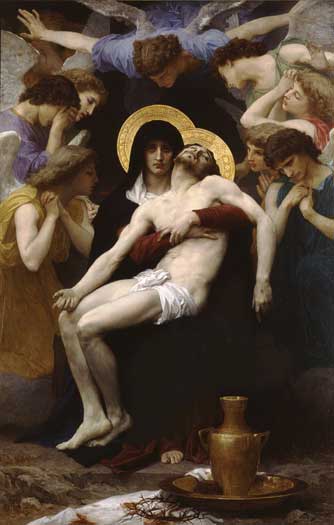
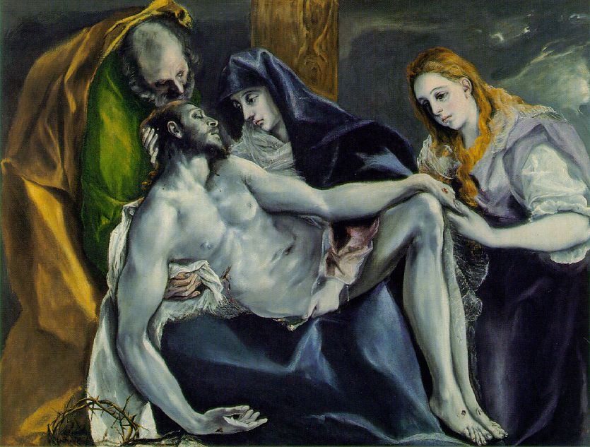
This episode focused on the regret of a character for the death of another and I immediately imagined the pieta. Of course comics are filled with this type of imagery:


although "googling" pieta you get a bunch of master srtists renditions which are all amazing and very different in style and composition.


(above) is the one i based (mocked) my piece on. i had originally wanted to draw all the crew of the defiant in the poses of the angels around him but didn't have time.


Though it bears little resemblance to its influence the posture and the look on Magas' face. I had, as I always do with star trek covers, various incantations and usually spend most of my time trying to figure out what option to take. The coloring came out of the short time I took on it, but with the colors it almost worked in a very iconic pop art way. I eventually added the glow on top of the lines (by just duplicating the white layer i used to color the wings and Gaussian bluring it above the lines) as a way of finding a middle between the pop art route and the feathers route i also had planned out using a layer type and a b+w photo of feathers.

I have also posted a small, fast (2 hrs) mini i made to send to my little brother a few years back called THE DRAGON AND THE 3 LITTLE BOYS.

And have finished my Aquajones promo covers which I will be sharing with you all soon. First I thought I'd post this pic from one of the first freelance pieces I did for CFU magazine in Co. Most the other stuff can be found on my DA page. They later used this image and retyped his speech bubble to match what they were doing that month. Not great but not bad for still being in highschool (at the time).