Showing posts with label death of superman. Show all posts
Showing posts with label death of superman. Show all posts
Tuesday, July 19, 2011
Street fighter and Nu DCU
Chun Li vs Cammy vs Vega by ~xaqBazit on deviantART
My DC comics relaunch trinity by ~xaqBazit on deviantART
No West to Cross promo by ~xaqBazit on deviantART

Sunday, June 20, 2010
The Industry (inking) 2

When asked why his style had changed over the years since Spiderman 2099, Rick Leonardi was nice enough to show me his thumbs, pencils, script and samples of different inkers over him over the last decade or two - and sited the inker's interpretation rather than his own style changing that may have lead to the change I referred to.

I also found this in the back of a Spectre issue, which was short and helped answer some of the questions I had about how far and inker's hand goes. Specific things to watch are the city in the background, the rendering on his arm and the musculature in his shoulder, among the other things the article mentions.


I also found this comparison a fun example of inking styles, since they are a similar composition and subject, but two decades apart. James Whynot did the inks and Drew Zucker did the pencils on the Aliens one. And obviously Brett Breeding and Dan Jurgens did the Doomsday one.
But I've really been back and forth about how much inker's are meant to do - if they only control the look of the lines and not the placement - or do you look at inkers as "art partners" and that pencils are basically glorified thumbnails, meant to be finished out in the interest of the story and storytelling, above all else. The article does point out the difference between "finishers" and "inkers." But I'm starting to learn there is a lot of gray in between.
Saturday, November 28, 2009
A few small things
Just a few small things. I know these are some bad pics as I struggle to get my camera back.
I found some new Kelley Jones work relatively in comparison to what I had been looking at. I liked a few experimental things he was doing since he was inking himself. Like using his fingerprints in the backgrounds here almost like Kirby crackle.


Something I will be trying in my current work.
Or here where just the barage of textures and intersecting lines made me think of that scene Todd Mcfarlane points out from Ninja scroll on the Animatrix Special Features, where there is a successive pop of black and white in the background just to give you a jarring effect - you may not even be consciously aware of as a reader/viewer.

I found these two dps’ in Marvel’s thor from 200-something and in the Elementals circa 1990. Almost two decades and a completely different publishing company and artists apart its interesting to see how they both interpreted the same mythological place differently - Asguard.


And last I found one of the artists in the Death of superman graphic novel doing this with small buildings in backgrounds for windows. Where he would ink a few parallel lines straight down and then cut across them with whiteout with a few parallel lines - forming small rectangles only a line width thick but none the less effective and faster and more consistent than just the straight black on white technique of drawing a separate line for each window.

Also my little bro broke his wrist playing with some friends but my family was able to make this sticker and attach it w/ SuperGlue so he could have something I made with him since I couldn’t draw on his cast. I posted the art on my DA page a few weeks ago and had made the image as a present for his birthday party.

I found some new Kelley Jones work relatively in comparison to what I had been looking at. I liked a few experimental things he was doing since he was inking himself. Like using his fingerprints in the backgrounds here almost like Kirby crackle.


Something I will be trying in my current work.
Or here where just the barage of textures and intersecting lines made me think of that scene Todd Mcfarlane points out from Ninja scroll on the Animatrix Special Features, where there is a successive pop of black and white in the background just to give you a jarring effect - you may not even be consciously aware of as a reader/viewer.

I found these two dps’ in Marvel’s thor from 200-something and in the Elementals circa 1990. Almost two decades and a completely different publishing company and artists apart its interesting to see how they both interpreted the same mythological place differently - Asguard.


And last I found one of the artists in the Death of superman graphic novel doing this with small buildings in backgrounds for windows. Where he would ink a few parallel lines straight down and then cut across them with whiteout with a few parallel lines - forming small rectangles only a line width thick but none the less effective and faster and more consistent than just the straight black on white technique of drawing a separate line for each window.

Also my little bro broke his wrist playing with some friends but my family was able to make this sticker and attach it w/ SuperGlue so he could have something I made with him since I couldn’t draw on his cast. I posted the art on my DA page a few weeks ago and had made the image as a present for his birthday party.

Saturday, October 24, 2009
Pacing
The curse of losing my internet (at home) has actually been a blessing in disguise and I’ve been working very diligently on my comic work. I wrote myself a not that says “this is your job, treat it like one ” above my desk. Working at home the lines between work and leisure can be thin if you let them. But I think I’ve overcome them. Without giving anything away, I’ve stressed making the characters look different from one another instead of basic male/female models w/ different clothes/hair. I’ve also been reworking some of the scenes to imply things/creatively concealing other that just showing it. But its been tricky looking at it and seeing how much the reader has to put together and how crucial it is if the reader skips over it. I’ve also been working very very fast drawing things but my time has been going back and looking at things critically/logically. Making sure that stairs have handrails, corners have trim, doors have frames and hinges etc etc.
Expressions have also been tricky, for this story, for example, I have many close ups with similar expressions but I’ve been working to make them all unique from one another and all different levels of the feeling they are expressing. I’m also doing enough pages now its been especially fun to mess with layouts and look back and know that I haven’t done certain things with layout that I look for places to try it out. Which is making me look for different things when I look at artists, making me see different reasons why I liked certain artists and see through others I thought were good but now I see where they cut corners.
I also just acquired the majority of the second volume of Elementals - which is all written/plotted by Bill Wilmingham, which is good and as the stories progress the artists have learned and grown and are getting much better. I don’t know if it was the time it was published or if Bill is just outspoken, or because it was a semi indy book but there are various places where I see something/hear something and I look back at it and just go “I can’t believe he just got away with saying that and wasn’t stoned to death as he would in this day in age. In some places he seems to be also pushing the readers buttons just for shock value and that is annoying because there is no depth to it, I don’t mind when there is - as many of the plot lines have pushed the boundaries in ways I respect, some of the most famous are referenced at the elementals Wikipedia page. But some of the dialog and small scenes I just block after time because of Bill's outspoken homophobia and racism (even going as far in some issues to use the "N" word, which I wouldn't mind if a racist character said - I know the difference between character's opinions and their writer's - but it was in response to a letters column.) that's not to say that he now, it was the 80's/early 90's and homophobia was at a high point with all the new but not understood info about HIV. But he could be a product of the time just like most people have someone they know who has a racist grandparent or something of the like because of the generation they grew up in.
Also as I'm making clear with current projects I'm working on, excessive cursing (no
i don't think comics should be controlled/silenced etc from what can/can't be said) as bill has said several times in th letter's column "if you don't like my book, don't buy it." but i do think it, makes me at least, jump back from what I'm reading - takes me out of the story/reading experience - and anything that does that should be avoided. I've met writers like Mike Barron who only want artists that render sparingly because he believes if you render like Jim Lee it interrupts the reading flow of the story the writer takes time to pace out. which is true, I can see his point - artists like Mignolla even simplify their style when it comes to fight scenes so you read faster - which is a cool idea as well. All I'm trying to say is I think you can have your cake and eat it too. I think books like Watchmen accomplished plenty in character depth etc with sparse cursing, and yet you get how mad, sexist etc a character is.
All this drawing for other people's stories has also got me inspired to write again and I have had great success revisiting old ideas after years of letting them "cook" as Darwyn is famous for with projects like "hunter" and am excited about the possibilities that they are unfolding. I've also been reading some great stuff like...
The Hulk series - bruce jones
Daredevil series - b.m. bendis
Death of superman - louise simonson/jurgens etc.
Knightfall - dixon
the enigma - pencilled by duncan figredo
and how they really take advantage of the serialized format in comics. thats why i always thought it would be fun to write for soaps with a team of guys - and build towards "friday cliffhangers!"
I've also realized what a big difference it makes to be consistent. Looking back I was in love with Astonishing X-men artist John Cassiday, but looking back I realize some of that, as well as Dave Gibbon's work was just a ridiculous amount of consistency in their style etc.
Expressions have also been tricky, for this story, for example, I have many close ups with similar expressions but I’ve been working to make them all unique from one another and all different levels of the feeling they are expressing. I’m also doing enough pages now its been especially fun to mess with layouts and look back and know that I haven’t done certain things with layout that I look for places to try it out. Which is making me look for different things when I look at artists, making me see different reasons why I liked certain artists and see through others I thought were good but now I see where they cut corners.
I also just acquired the majority of the second volume of Elementals - which is all written/plotted by Bill Wilmingham, which is good and as the stories progress the artists have learned and grown and are getting much better. I don’t know if it was the time it was published or if Bill is just outspoken, or because it was a semi indy book but there are various places where I see something/hear something and I look back at it and just go “I can’t believe he just got away with saying that and wasn’t stoned to death as he would in this day in age. In some places he seems to be also pushing the readers buttons just for shock value and that is annoying because there is no depth to it, I don’t mind when there is - as many of the plot lines have pushed the boundaries in ways I respect, some of the most famous are referenced at the elementals Wikipedia page. But some of the dialog and small scenes I just block after time because of Bill's outspoken homophobia and racism (even going as far in some issues to use the "N" word, which I wouldn't mind if a racist character said - I know the difference between character's opinions and their writer's - but it was in response to a letters column.) that's not to say that he now, it was the 80's/early 90's and homophobia was at a high point with all the new but not understood info about HIV. But he could be a product of the time just like most people have someone they know who has a racist grandparent or something of the like because of the generation they grew up in.
Also as I'm making clear with current projects I'm working on, excessive cursing (no
i don't think comics should be controlled/silenced etc from what can/can't be said) as bill has said several times in th letter's column "if you don't like my book, don't buy it." but i do think it, makes me at least, jump back from what I'm reading - takes me out of the story/reading experience - and anything that does that should be avoided. I've met writers like Mike Barron who only want artists that render sparingly because he believes if you render like Jim Lee it interrupts the reading flow of the story the writer takes time to pace out. which is true, I can see his point - artists like Mignolla even simplify their style when it comes to fight scenes so you read faster - which is a cool idea as well. All I'm trying to say is I think you can have your cake and eat it too. I think books like Watchmen accomplished plenty in character depth etc with sparse cursing, and yet you get how mad, sexist etc a character is.
All this drawing for other people's stories has also got me inspired to write again and I have had great success revisiting old ideas after years of letting them "cook" as Darwyn is famous for with projects like "hunter" and am excited about the possibilities that they are unfolding. I've also been reading some great stuff like...
The Hulk series - bruce jones
Daredevil series - b.m. bendis
Death of superman - louise simonson/jurgens etc.
Knightfall - dixon
the enigma - pencilled by duncan figredo
and how they really take advantage of the serialized format in comics. thats why i always thought it would be fun to write for soaps with a team of guys - and build towards "friday cliffhangers!"
I've also realized what a big difference it makes to be consistent. Looking back I was in love with Astonishing X-men artist John Cassiday, but looking back I realize some of that, as well as Dave Gibbon's work was just a ridiculous amount of consistency in their style etc.
Wednesday, September 23, 2009
Moving

I might be doing a 12-pg piece for Cosmic Times here coming up and just finished my cover for What the Flux comics. I've had a little extra time this week for packing and have also been able to read some comics, specifically event/crossover titles. I got the 1st two graphic novels for Batman: KnightFall and The Death of Superman. and got to read the image miniseries Fight for Tomorrow. As well as finish what I had of Elementals vol. 1 and a few scattered issues into volumes 2 and 3.
Elementals was great up until the final last few issues, that their creator/artist Bill Wilmingham had nothing to do with and according the The Elemntals Wiki page dropped off of comico's map for a while. He apparently supervised vol. 2 and I have a few good issues from it that he even came back to draw. Towards the end of vol. 1 you could tell it was beginning to get into the 90's market, variant covers, specials, spin-off titles that never got past the 1st issue. By the time vol. 3 rolls around that's all it is, and the only reason worth reading the issues are some of the writing, which is still interesting as it starts to break all the rules the 1st volume set and expand the world. Though there are various obvious marvel/dc rips and rip-offs as well as fill in stories that are self contained and irrelevant. They even did Sex-specials - originally saying it would further explore their characters, then moved onto swimsuit and lingere specials where it became increasingly aparent they were looking to turn a buck and capitalie on all the horny teenagers using their parents money to buy comics - just like the other comics at that time.

Willmingham was a good storyteller, not a great artists, but i got used to it, a very non-pc writer but he was fairly good at pacing and plotting and kept it interesting.
Knightfall and Death of Superman are similarly great for those reasons, pacing and plotting. Thank you Louise Simonson and Chuck Dixon. They are essentially the same story:
Act 1) hero gets injured
Act 2) new heroes step up,
Act 3) old hero returns and must fight to reclaim his mantle.
But they are done very differently and both explore, fairly deeply, the philosophy of the main character - through the viewpoints of the secondary characters, since the hero isn't there to do any of the things they are talking about. I also got Kelley Jones' Deadman, which is among my favourite of his work. And there is experimentation at every turn, some things working amazingly, others not. Even to the point he uses his fingerprints to put down the ink. I'm also intrigued by the plot for the story as I don't know much about his character.
I have been working on finalizing a script for a graphic novel with James that I will pencil and he will ink while im down that way. During which time we will finish plotting and writing the scripts for the rest of Maelstrom. I'm hoping to get A project done, period, with him so we have something to show for our work and as we have played off of before we are trying to mix our styles. In the upcoming series I may just let him pencil and ink himself for the flashback sequences, or something - like marvel has been doing with JRJR and Joe Kubert on X-men.
Tuesday, June 23, 2009
Work - Yay!

here's the inks for the piece on the previous post.
So after a few days of looking around and sending out about 25-30 emails, I've found a few freelance gigs.
I'll be doing a set of 50 8x10 quick paintings for a local band called the AQUAJONES, for their promotional packets.
I'll also be working on a secret project - all I can mention is what was mentioned on their post on Digital Webbing since I have to sign a non-disclosure agreement:
Artist Needed For Super Hero-Related Marketing Project
First off, this is a "purely for exposure" kind of gig.
I'm heading up part of a team developing a promotional campaign for an upcoming web series. As part of our efforts we're developing at least one mini-comic.
We'd need either one artist or a small team to help produce around eight pages of sequential art--pencils, inking, coloring and lettering.
This could be a fun project for the right person/team. You'd get full credit and your work would be part of a project with potentially high visibility.
I'll be scanning my skateboard designs and getting in touch with them this next week - should go well.
I got a lot of nods from people on Digital Webbing but was ultimately passed over, not bad for getting my foot in the door. Hopefully I will be able to post some work soon, as the Aquajones need the first 10 by the end of the week. I am still w/o a scanner but it is the first place any money from these projects will go. I also put up a piece I did a while back for Dave on DA.
Wonderboy: Hero Initiative by ~xaqBazit on deviantART
I also just acquired the "best selling graphic novel of all time" - The Death of superman and was disappointed that Jurgens/Breeding only did 2 issues, but I should have known since the GN is compiled from all the differnet issues from different superman series that the Doomsday event crossed over into, so the regular artists form each got to do an issue too. Jurgens/Breeding's style for the actual issue, (Superman 75) is rather strange.
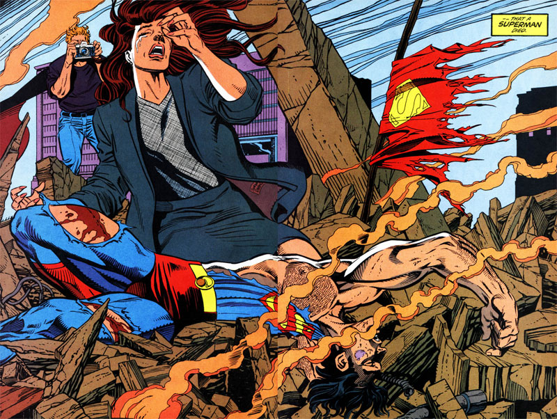
It's all full page spreads, some of which are majorly wonkey, others are great, all are iconic, but its almost as if they worked on them smaller and blew them up. The feathering and line weight are way larger than you would ever get with panel-to-panel pages. Idk, just an observation. Also noticed that this image by Bruce Timm is based of one of the small panels that Jurgens/Breeding did in Superman #74.

I'm also trying out for a new Metal-core band tonight called Next of Sin. Well see how it goes.
Subscribe to:
Posts (Atom)